Designing a flight booking website

Simplifying and improving the flight booking process for users

The project at a glance.

The product.
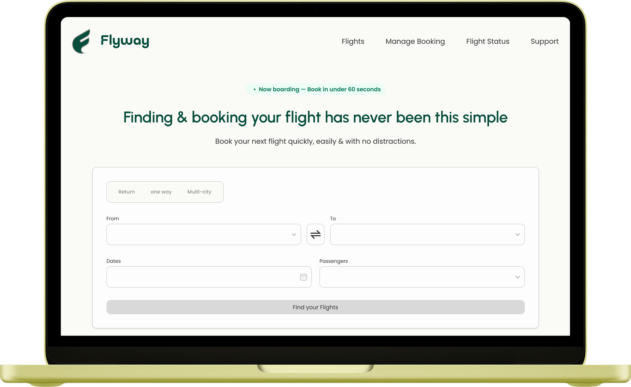
A Website designed to demystify the flight booking process by simplifying heavy information density, and streamlining add-on options into a highly visual path.
The problem.
Users frequently face massive cognitive resistance due to misaligned multi-airline capabilities, obscured navigational controls, and rigid form fields that disrupt data entry.
My role.
Solo Designer for the end-to-end process—responsible for initial research, market analysis, UI design, and interactive prototyping.
Tools and methods.
Tools: Miro, Figma, FigJam.
Methods:
Competitor Analysis, User Journey Mapping, User Flows, Pen-and-Paper Sketching, and Medium-Fidelity Prototyping.
Duration.
2 Months by dedicating 5–7 days of focused execution per design phase.
Understanding the problem.
Before moving into design , I conducted research to uncover user goals, behaviors, and critical pain points.
This discovery phase provided the strategic foundation for every design decision that followed.
1
Usability Tests
2
Affinity Diagramm
3
Journey Map
Usability Test
Competitor Cross-Examination and Real-Time Participant Observation
Target participants encountered repeated misdirection, ambiguous fare descriptions, and unsupported actions on partner-airline flights that eroded trust in the booking process before the payment step could even be reached.

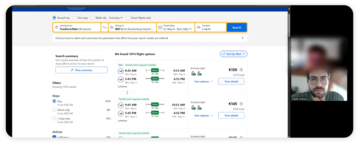
Observing the Booking Journey in Real-Time

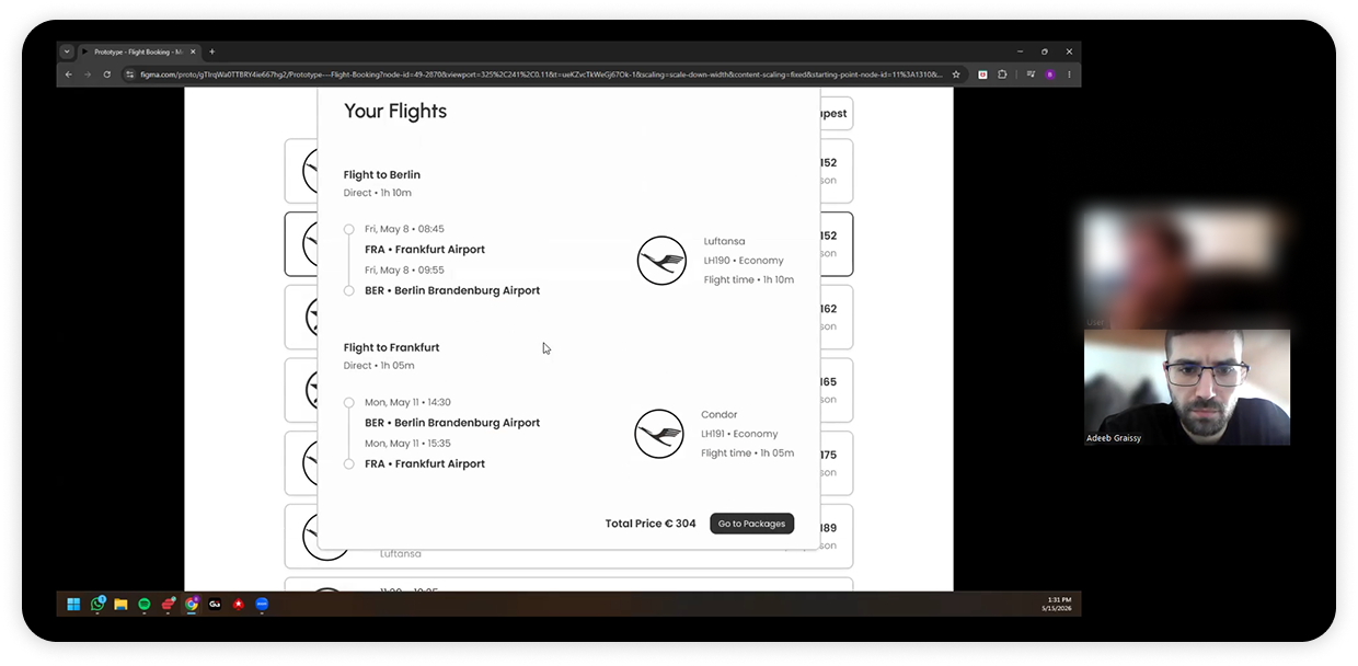
I conducted an in-depth usability analysis of five major competitors in the flight booking and travel aggregator market, including Aer Lingus, British Airways, Ryanair, Booking.com, and Trip.com, by observing structured usability testing sessions focused on the complete end-to-end booking experience.
To uncover user goals, behaviors, and critical pain points, I conducted primary research, which included a qualitative usability test with a target participant.

Opting for this approach allowed me to observe real-time friction points and deeply explore user behaviors, establishing a solid strategic foundation for all subsequent structure/layout decisions before moving into the design phase.

Key findings.

Hidden costs, unclear terminology, and unnecessary booking steps created recurring friction points across multiple platforms. The usability sessions showed that users rely on clear pricing visibility, intuitive navigation, and simplified interactions to complete bookings confidently and without confusion.
Affinity Diagram
Concealed €0 Placeholders & Phantom Ancillary Costs
Users experience an unexpected pricing disruption during checkout. The Travel Extras summary line explicitly reads €0, yet it silently expands to reveal a hidden charge of €23.36. This misleading interface behavior tricks users into wrongly believing that no add-ons, including their essential travel insurance, have been selected.

Clustering Raw Observations Into Strategic Friction Themes.

After testing concluded, every observation and quote was transcribed onto sticky notes and clustered into an affinity diagram organized under eight thematic columns

Key findings.

Pricing opacity leads to misinterpretation as €0 masks extra costs and insurance assumptions.
Payment friction stems from unsupported cards and missing visibility of discounts/options.
Carrier integration gaps reduce trust.
Missing seat and baggage blur airline vs aggregator.
Overall, numeric ambiguity and transparency gaps increase cognitive load and weaken decisions.
Journey Map
Accidental Stay Searches and Buried Skip Controls
Users suffer a "silent misstep" when they accidentally search for stays instead of flights and only catch the error on review, compounded by skip buttons hidden below the fold that force unwanted scrolling and by payment screens that omit expected card types and loyalty options.

Mapping User Goals and Pain Points Across Chronological Stages.

Drawing directly on the synthesized affinity data, the user lifecycle was tracked across seven documented chronological touchpoints.

Each touchpoint was articulated through its context, goals, behaviors, pain points, and an experience rating, and was anchored to specific recorded user quotes rather than generalized personas.

Key findings.

The journey revealed recurring breakdowns in visibility, pricing transparency, and decision support that increased cognitive load across critical booking stages. Ambiguous defaults, hidden controls, and low-prominence information caused unnoticed selection errors, while incomplete payment and loyalty options weakened trust and disrupted purchase confidence near checkout.
Designing the solution.
With a clear understanding of my users and their needs, I began designing a solution that addressed the key pain points uncovered during research. My focus was on creating a flight booking experience that felt transparent, trustworthy, and effortless to move through. I explored different ideas through sketches, wireframes, and prototypes, testing and refining the design based on user feedback at each stage.
5
User flow
6
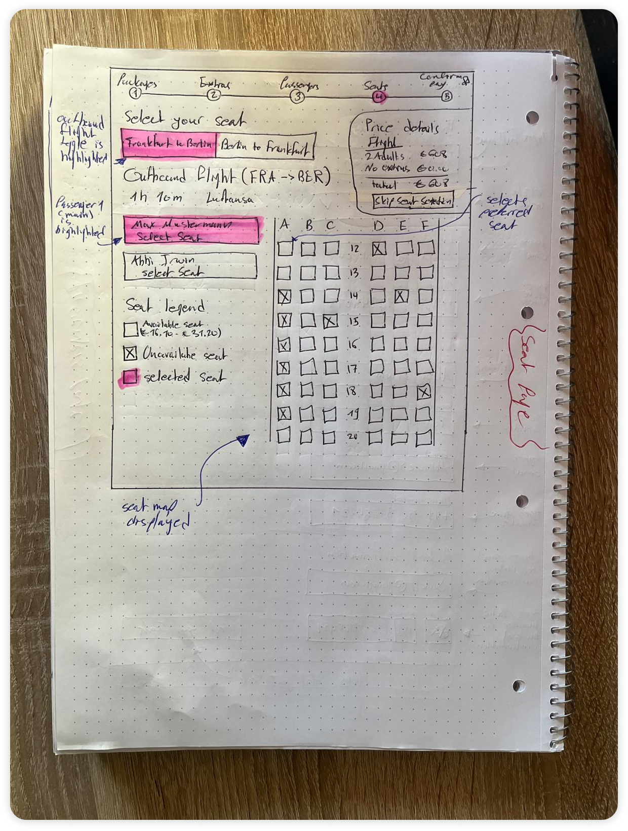
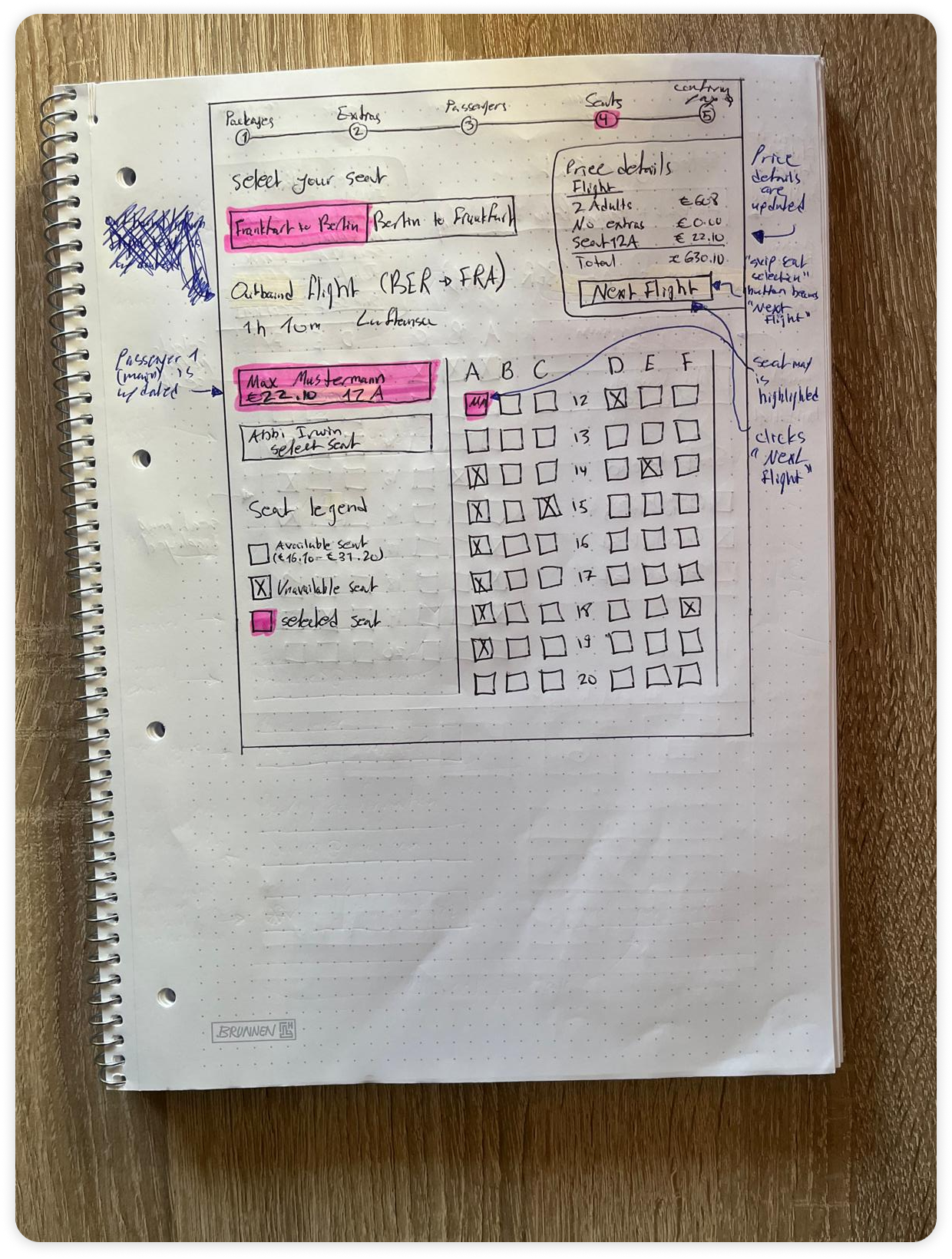
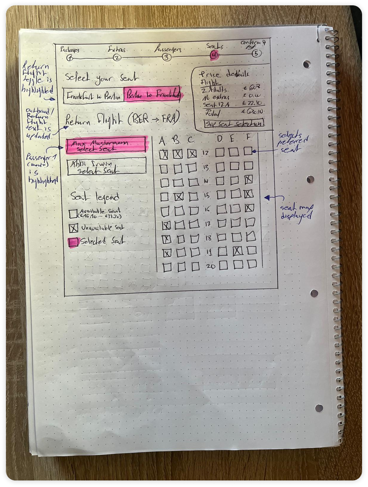
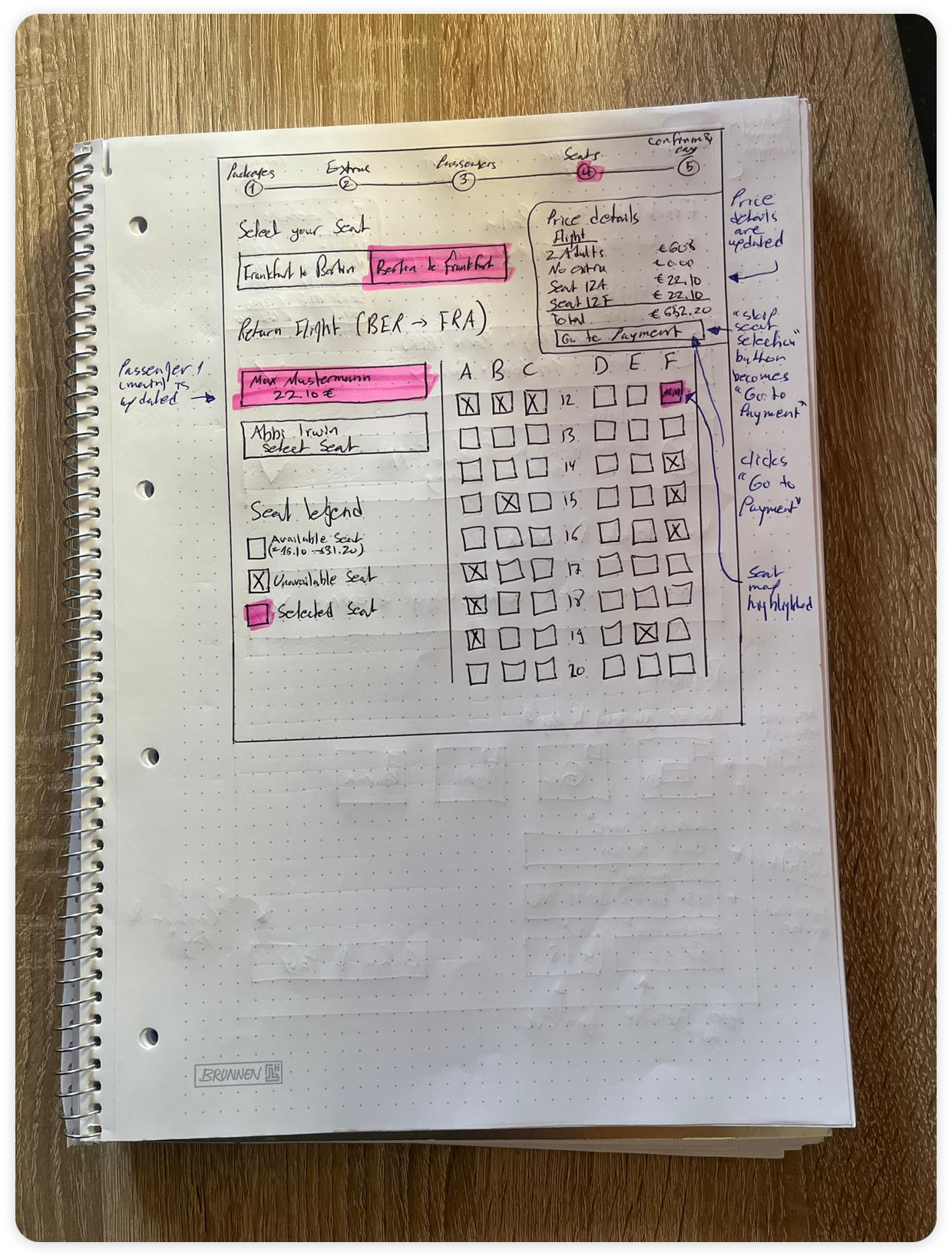
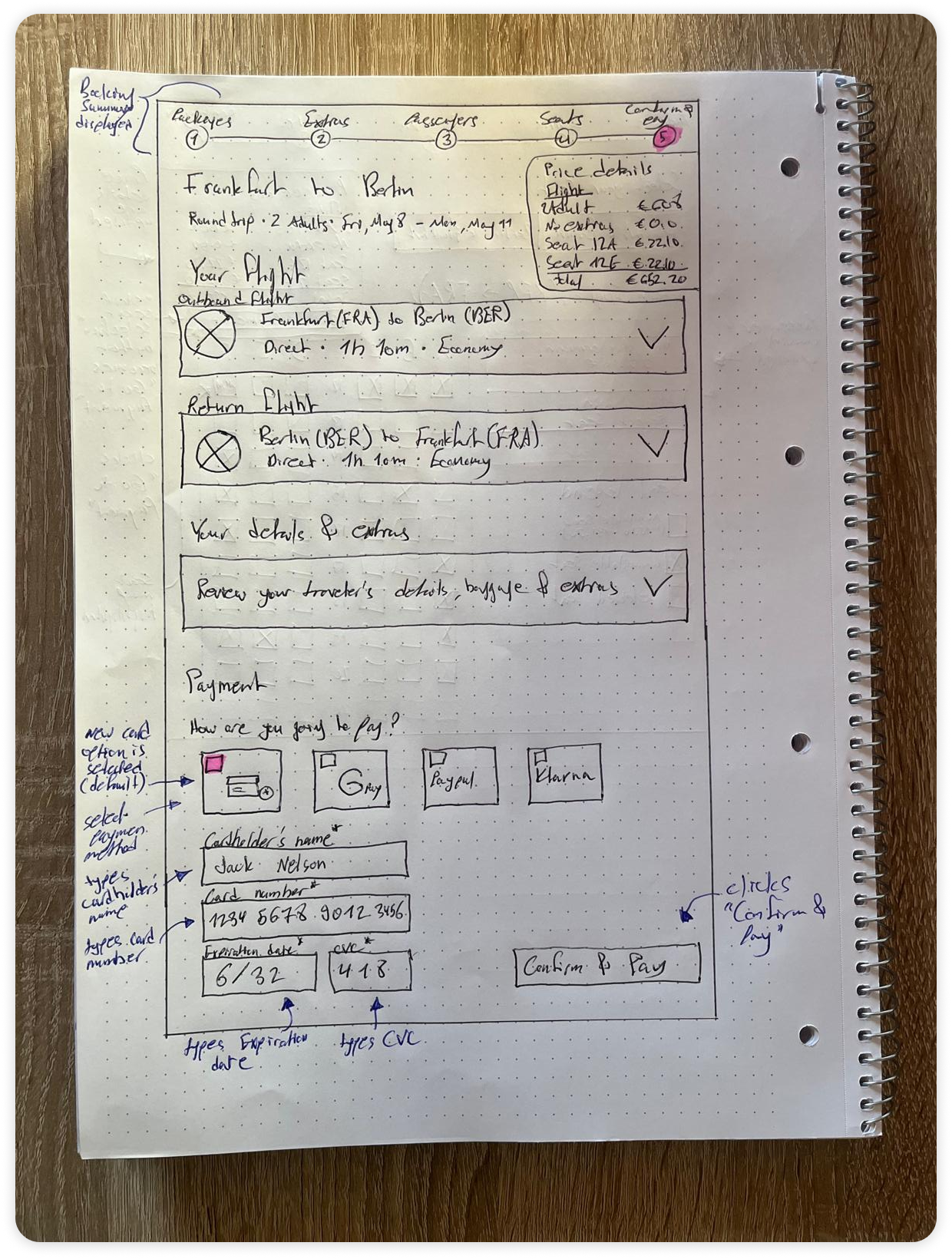
Sketching
7
Prototype
8
Testing
9
Iterations
User flow
Linear Five-Step Progression and Sequential Seat Assignment
Users gain orientation from a strictly sequential step indicator that guides them from package selection through to a successful booking confirmation without ambiguous detours.

Defining Navigation Rules and Sequential Paths End to End.

A clear end-to-end flow was constructed to anchor the core decisions of the flight booking journey before any visual design work began. Tracing the path from initial search through fare comparison, ancillary add-ons, traveler details, seat assignment, and final checkout established a coherent navigational backbone that minimizes hesitation at every handoff. This deliberate sequencing connects user intent directly to task completion, addressing the specific friction points surfaced in earlier research while keeping the path toward booking conversion focused and uninterrupted.
Sketching
Visualizing Information Hierarchy and Content Flow
Users need dense travel options, ancillary items, passenger fields, and a running cost breakdown arranged so that comparison and total-cost visibility coexist without crowding a single screen container.

Exploring Hand-Drawn Spatial Balance Across Screen Regions.

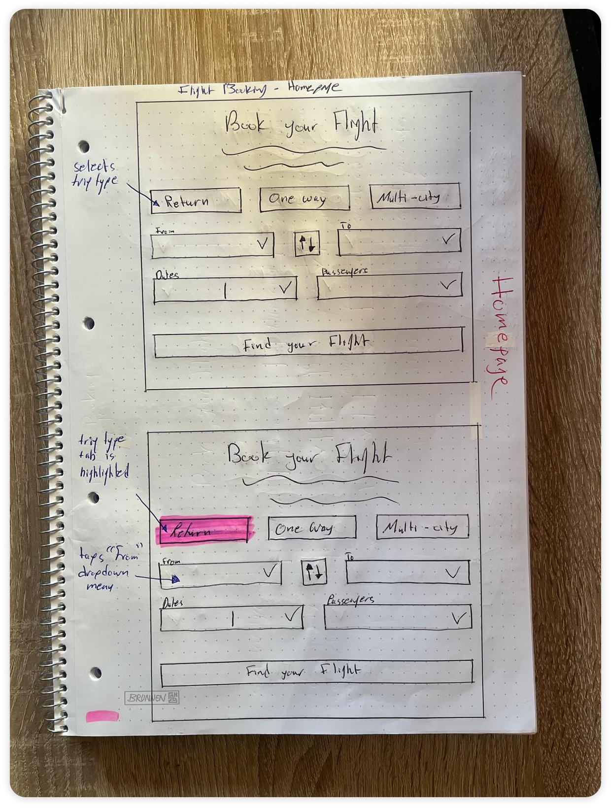
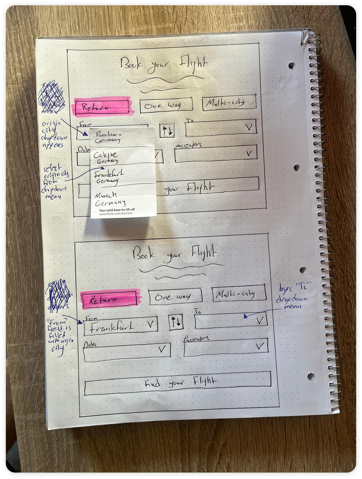
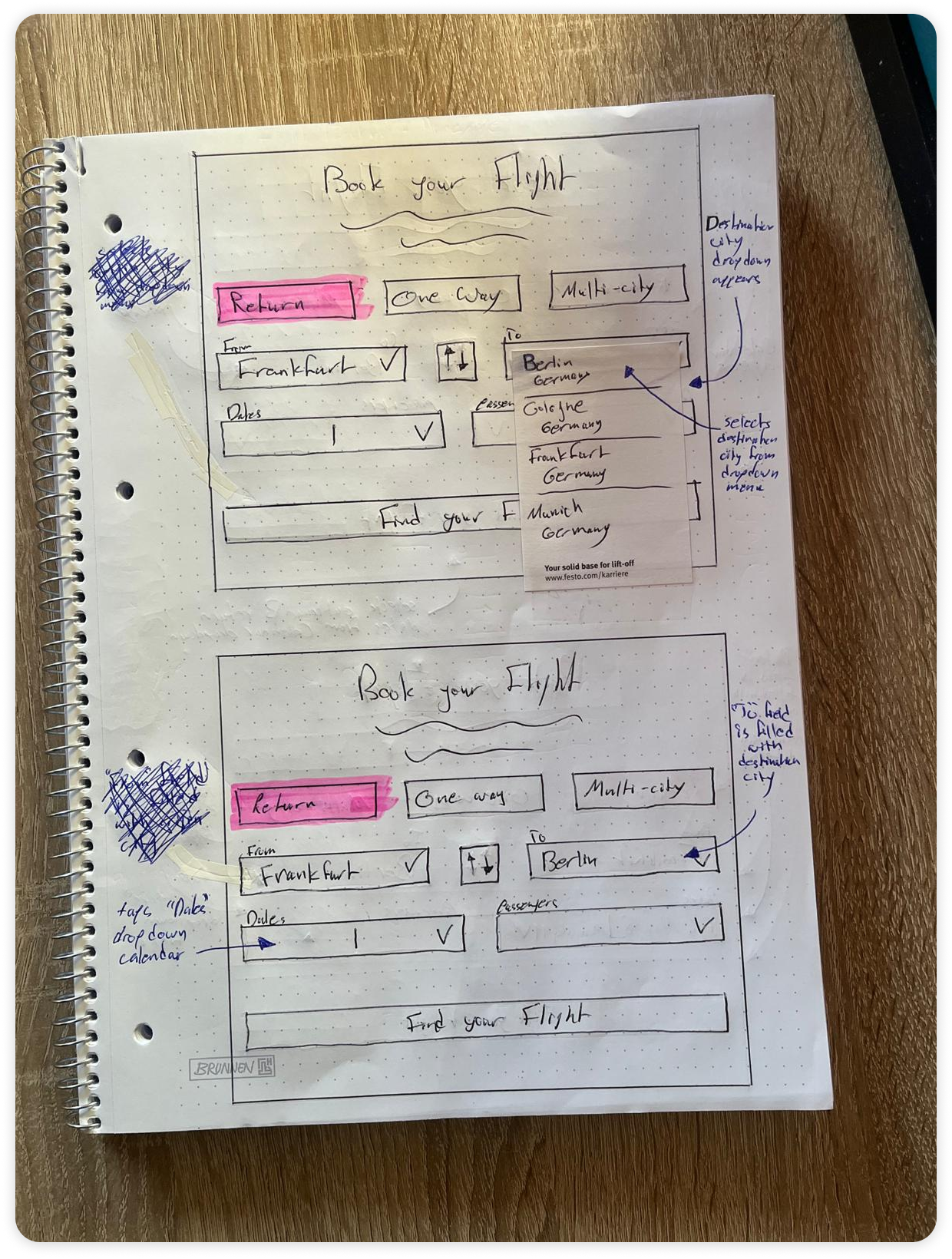
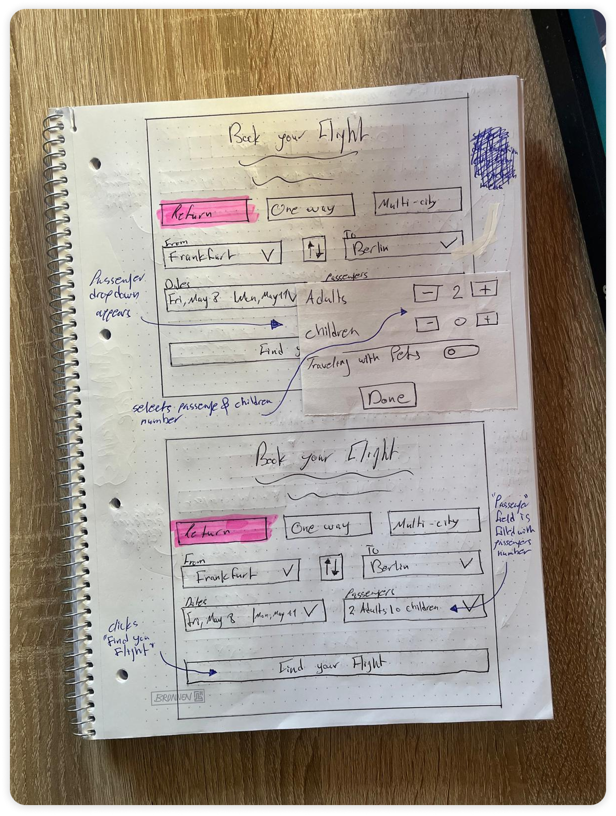
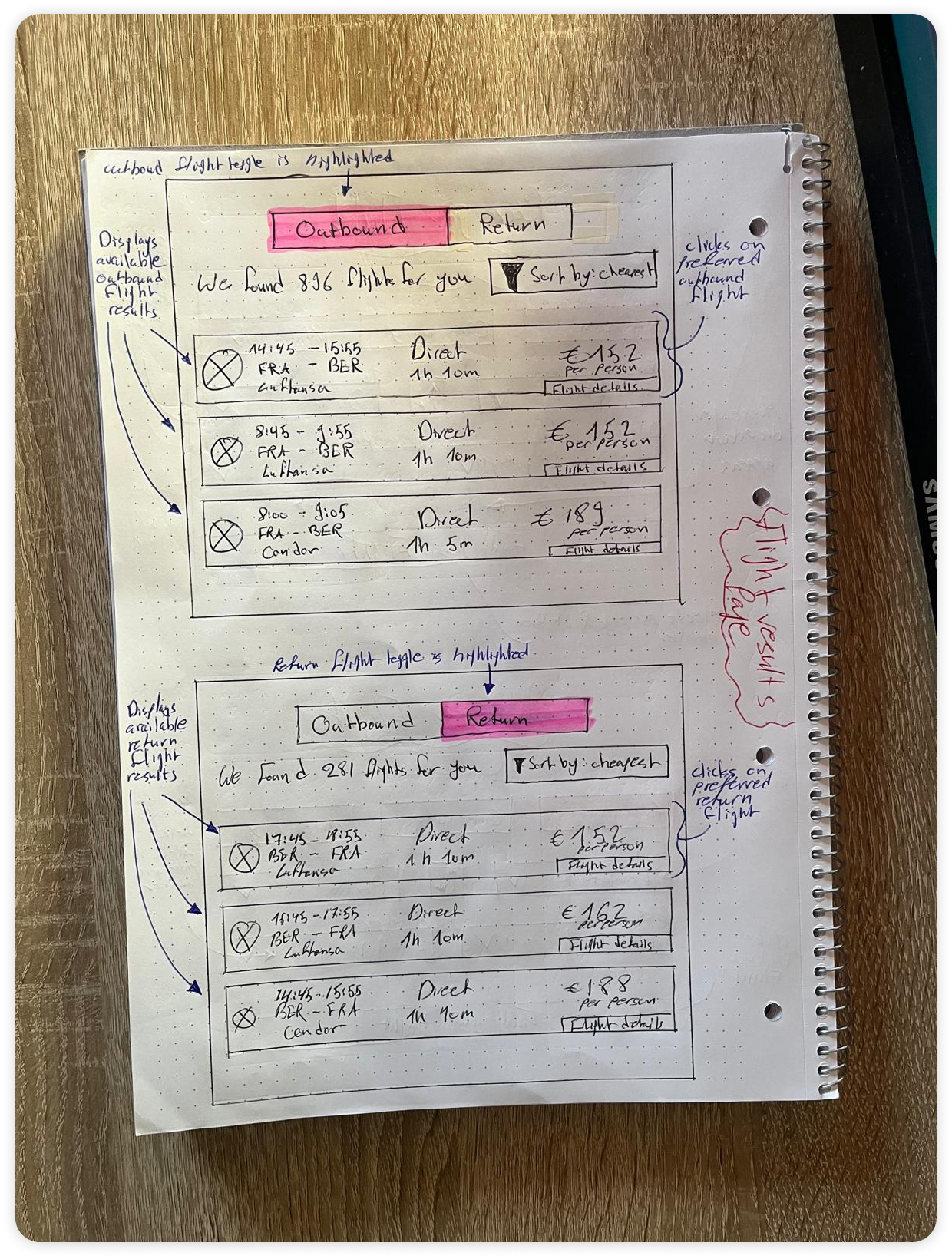
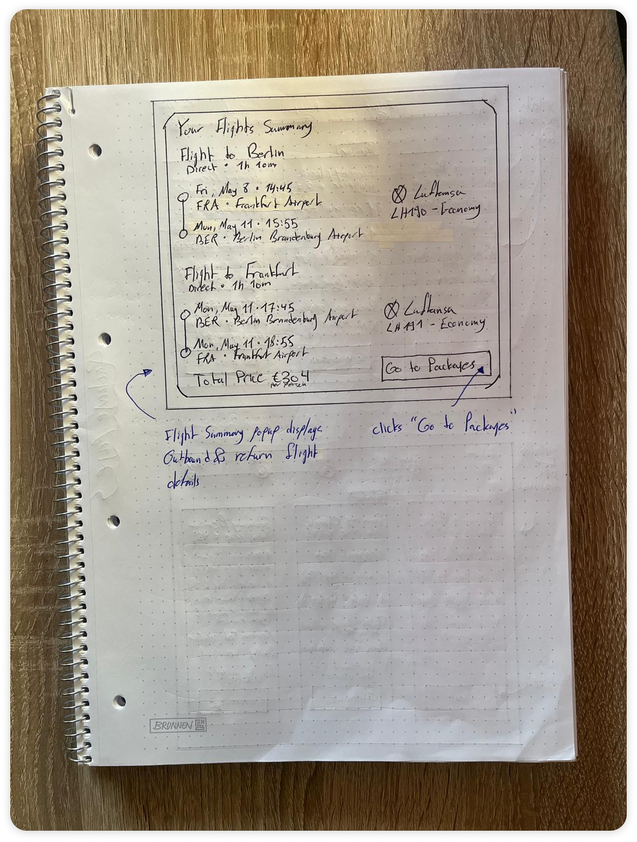
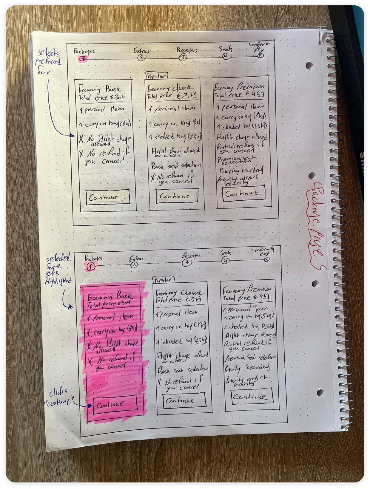
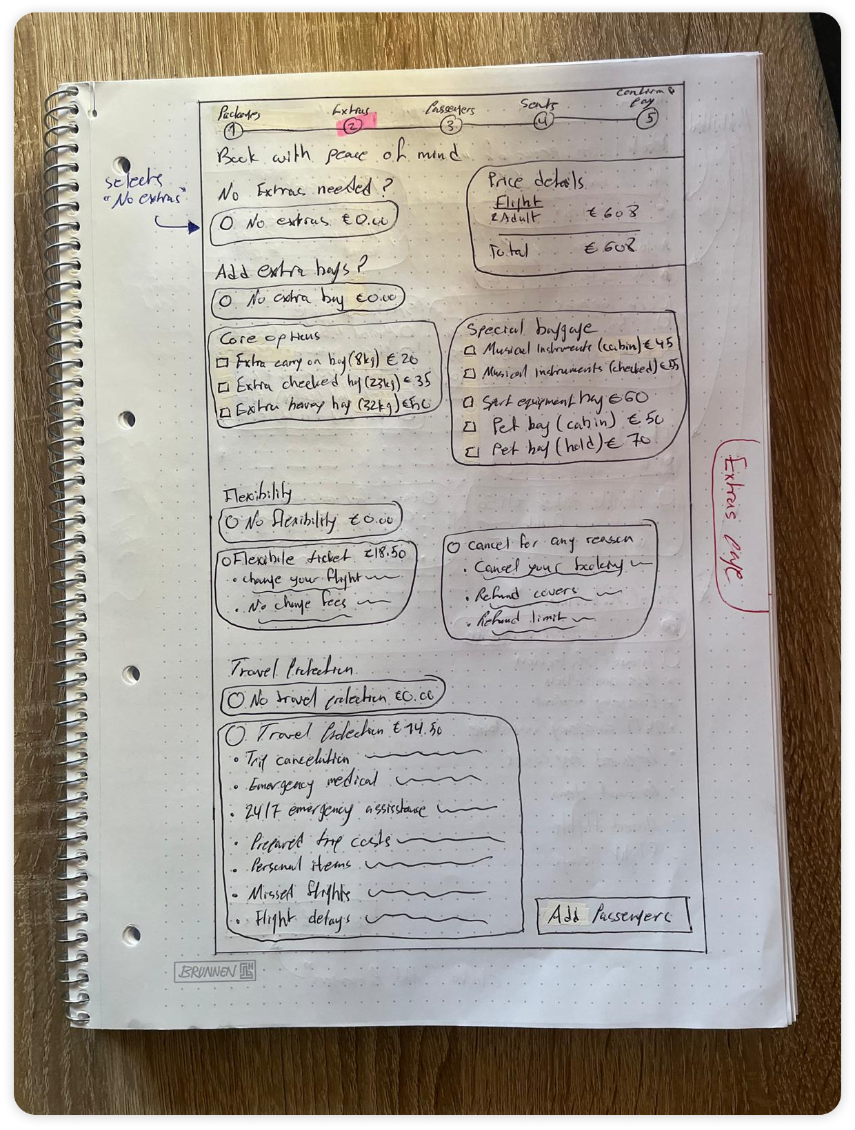
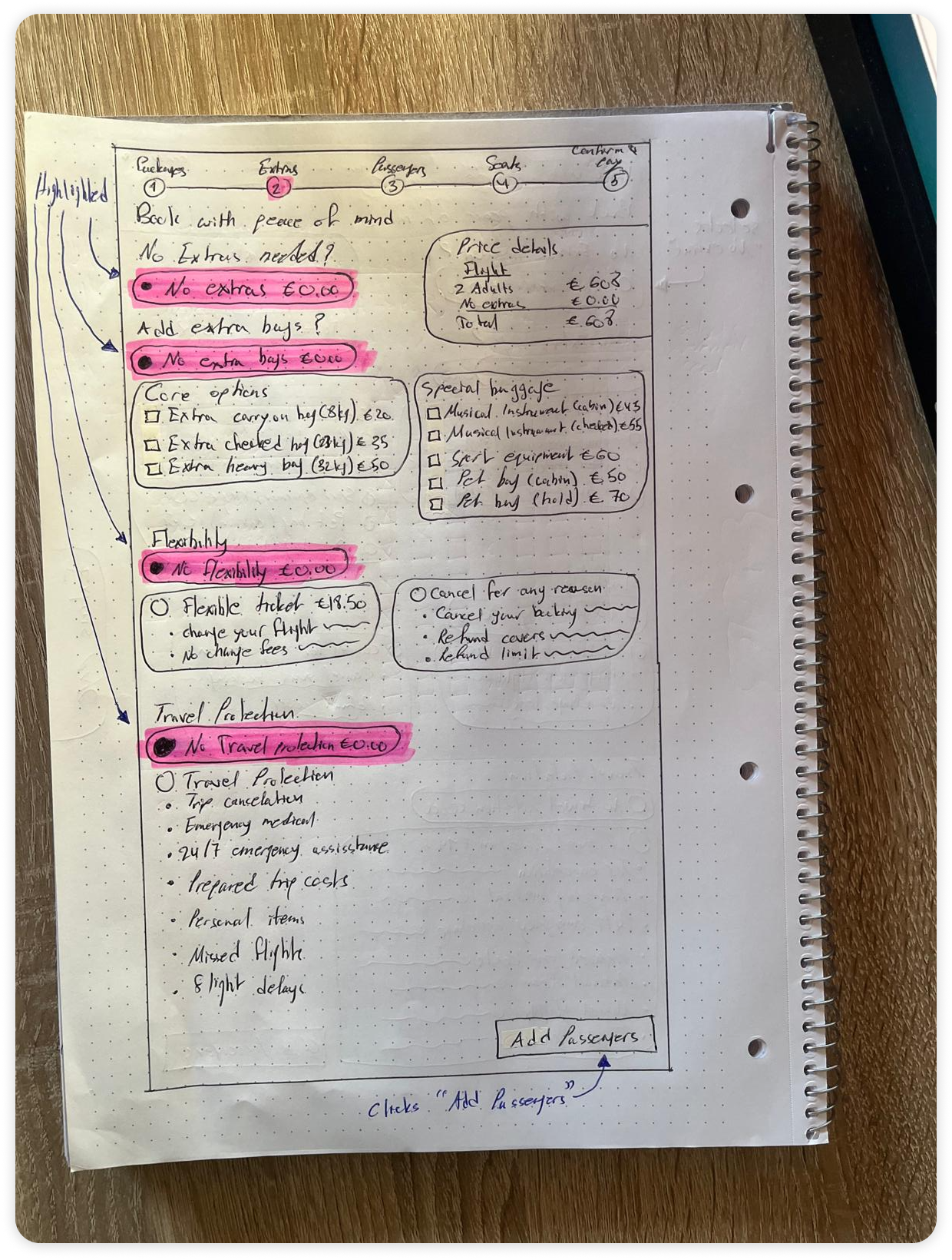
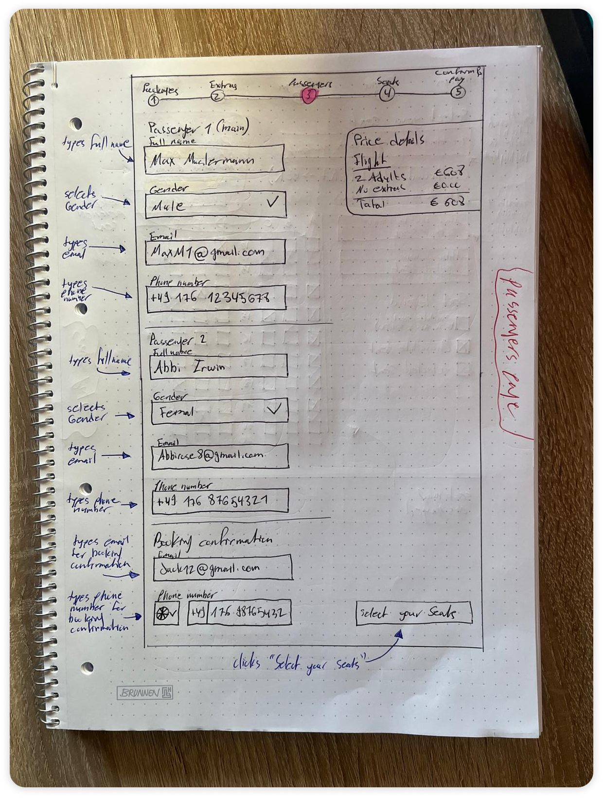
Once the navigational backbone was in place, I shifted into hand-drawn sketching as a fast, low-commitment way to test how each screen of the flight booking journey could hold its content without overwhelming the traveler.

Working on paper let me rapidly explore where fare comparisons, baggage choices, passenger fields, and the running price breakdown should live in relation to one another, weighing density against clarity before any pixels were committed.

This early, tactile exploration was driven entirely by the user's need to compare options side by side, understand exactly what each tap costs, and stay oriented within a multi-step purchase, ensuring that the eventual interface would prioritize transparency and confidence over visual decoration.
Prototype
Validating Booking Logic Through Structured Wireframing
Users often feel uncertain when ancillary costs, fare differences, and add-on selections appear scattered or hidden, leading to hesitation and abandoned bookings before reaching payment.

Translating Flow Logic Into Interactive Structure.

Building on the analog sketches, I moved into a mid-fidelity prototype to stress-test the interaction logic and information architecture without the visual noise of final styling or imagery.

This stage was essential for confirming that the proposed structure genuinely resolved the friction points captured in the journey map. By making the wireframe clickable, I could walk through each handoff between Packages, Extras, Passengers, Seats, and Payment to verify that the sequence felt natural and that every decision was supported by clear context.

To reinforce this, I introduced a persistent, price breakdown that itemizes each selection the moment it is made, directly answering the transparency concerns raised in research. This commitment to surfacing cost honestly, paired with a consistent step indicator and visibly accessible controls, keeps the traveler oriented and confident at every stage rather than questioning what has been added or what comes next.
If "Flows" sidebar is open, make sure to close it!
The Prototype is only available on Desktop & Tablet (991px)
Testing
Validating Design Decisions Through Real User Behavior
Even with a clear step-by-step structure, users can lose confidence if add-on value, total cost, and skip pathways do not match their expectations for a transparent and trustworthy booking.

Measuring the Impact of Transparency and Step Sequencing.

With the mid-fidelity prototype in place, I ran usability testing to confirm whether the design choices genuinely answered the friction points captured during the journey mapping stage.

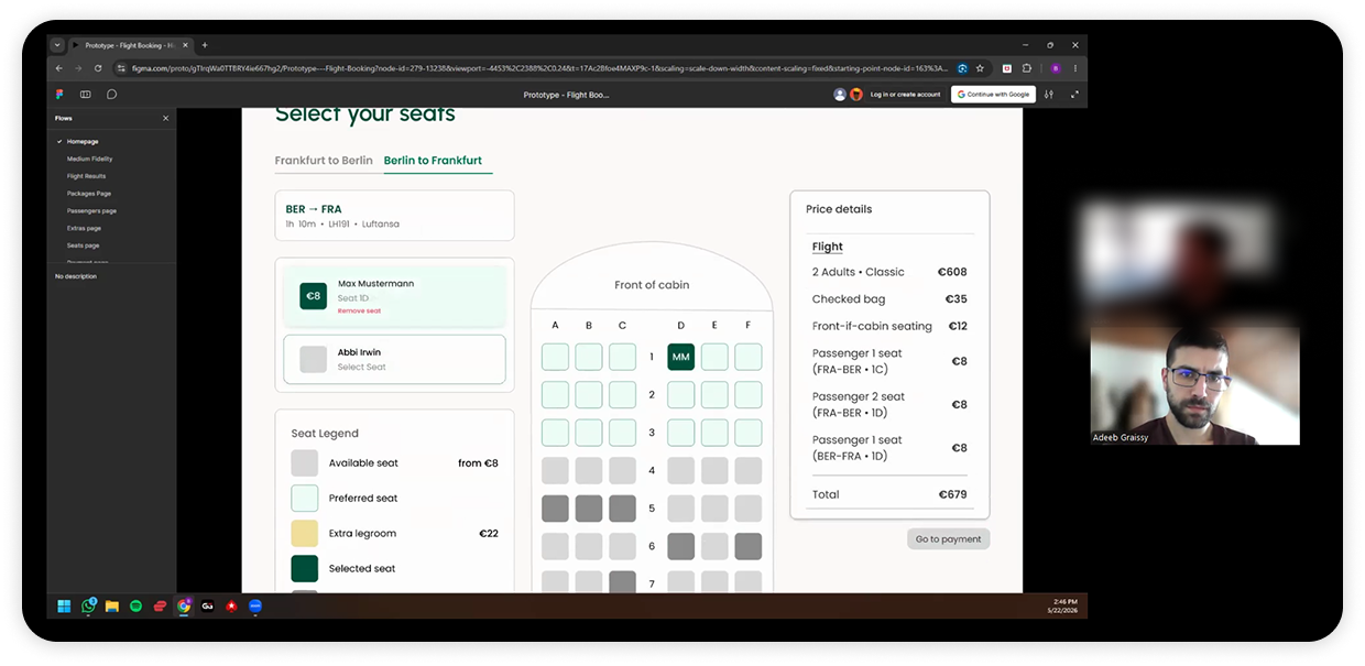
I paid close attention to how the participant moved through the flight booking flow, watching for moments of hesitation, confusion around ancillary pricing, or any sign that trip-length reasoning was being ignored by the interface.

Analyzing the feedback revealed that the participant responded well to the linear progression and the immediacy of the price breakdown, noting that the step indicator and running total made the journey feel honest and easy to follow rather than opaque or pressured.
User feedback.

Key findings.

While the linear step-by-step structure successfully reduced cognitive load, secondary navigation elements such as the outbound and return tabs failed to communicate their importance, causing hesitation precisely when the user needed orientation the most.
Equally,
foundational date context like month and year cannot be treated as decorative, since its absence undermines trust in an otherwise transparent flow.
These insights necessitated an iteration on contextual signposting and temporal clarity to ensure that every moment of transition feels obvious, grounded, and confidence-building in the final high-fidelity version.

Iterations
Reinforcing Wayfinding and Contextual Clarity Through Component Refinement
Users often feel disoriented or hesitant when navigational cues blend into the layout or when essential context such as dates and trip legs is left implicit, undermining their confidence at critical decision points. Following usability testing, I implemented key component refinements to better align the interface with user mental models:
Wayfinding: From Tab Pair to Step Breadcrumb

Usability testing revealed that the original Outbound and Return pill buttons in the top-right corner were read as a tab bar, suggesting two parallel views rather than a two-step sequence. Participants struggled to locate them and did not understand why a second flight selection was being requested.
My Approach

I replaced the tab pair entirely with a text breadcrumb sitting above the H1, reading "Step 1 of 2 · Outbound → Return." Reframing the control as a numbered step communicates sequence before the user takes any action, shifting the mental model from switching between views to completing one step and then the next. This is a structural correction to the confusion observed in testing rather than a cosmetic change.
From Generic Count to Specific Context

We found 233 flights for you," felt friendly but carried little information, leaving the leg, route, and date to be inferred from a small toggle in the corner.
My Approach

I rewrote the headline to read "233 outbound flights" with a supporting subline of "Frankfurt → Berlin · Fri 8 May 2026," packing the four critical pieces of context directly into the page header. The H1 now stands on its own, so a user returning to the page or arriving mid-task can immediately confirm they are in the right place without relying on secondary controls to communicate state.
Calendar: Surfacing Month and Year as Anchoring Context

This was a visual oversight on my part rather than a strategic gap, since month and year labeling is foundational to any date picker and should have been included from the outset. Testing showed that participants could not identify the month or year while interacting with the date calendar, removing the temporal grounding needed to confidently choose travel dates.
My Approach

I introduced a prominent 16px semibold label displaying the month and year directly within the calendar component. This small but foundational change restores the anchoring context the calendar was previously missing, ensuring that date selection fels grounded, deliberate, and free of guesswork.

Global Interaction Enhancements.

Beyond the targeted iterations on wayfinding, headline context, and calendar clarity, a series of refinements were applied to elevate the overall booking experience. Each enhancement was driven by the same underlying principle: surface what helps the user decide, suppress what does not, and ensure every interaction produces an honest, immediate response.
Flight results page
Consolidating Airline and Route Into a Single Metadata Line
The original row stacked three separate lines per flight, with the time on top, the route "FRA – BER" below it, and the airline name on a third line, giving equal visual weight to information that is fundamentally supporting context.
The refined row condenses this into a two-line block, pairing the time on top with a single muted metadata line that merges route and airline as "FRA → BER · Lufthansa," with the previous misspelling corrected. This tightens the row, allows the price and time to dominate as the true decision drivers, and produces a cleaner two-tier hierarchy between primary facts and supporting context.

Reordering Duration Above Stops
The middle column originally led with "Direct" and placed "1h 10m" beneath it, prioritizing a fact that carried no discriminating value when every visible flight was already direct. The order has been reversed so that the variable duration sits above the constant "Direct" label, ensuring the column actively helps the user distinguish between options such as a 1h 05m flight and a 1h 10m flight rather than presenting redundant information first.

Resizing the Airline Logo to Match Its Informational Weight
The airline logo was previously rendered at a size that competed with the time and price for attention, despite carrying far less decision-making value for the user. It has been scaled down to a smaller footprint within the row, allowing it to remain present as a recognizable visual cue without distracting from the core information the traveler actually compares when choosing between options.
Packages Page
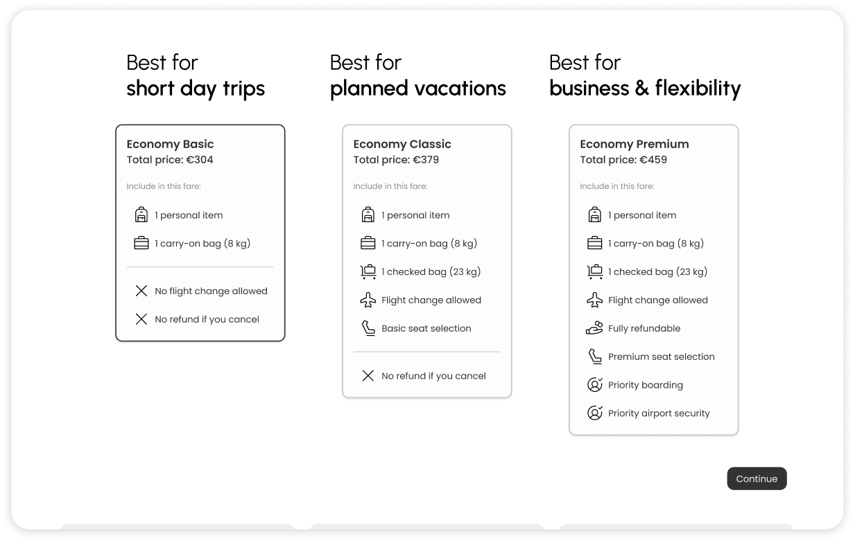
Plain-Language Positioning and Conditional Continue
The fare cards were refined with plain-language positioning labels reading "Best for short day trips," "Best for planned vacations," and "Best for business & flexibility," translating abstract tier names into trip-context cues that directly mirror the trip-length reasoning surfaced in testing. The Continue button was also adjusted to remain inactive until a fare card has been explicitly highlighted, preventing accidental progression and reinforcing the deliberate, one-decision-at-a-time rhythm of the flow.
Extras Page
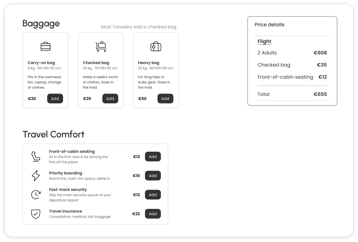
Explicit Add Controls and Itemized Price Lines
To eliminate the cost confusion observed earlier, every ancillary was rebuilt around an explicit Add control that writes a named, priced line directly into the Price details ledger the moment it is selected. Choosing a checked bag visibly appends "Checked bag €35" and front-of-cabin seating appends "Front-of-cabin seating €12," replacing the previous ambiguous €0 placeholder behavior with a transparent, traceable record of every choice the user has made.
Seats Page
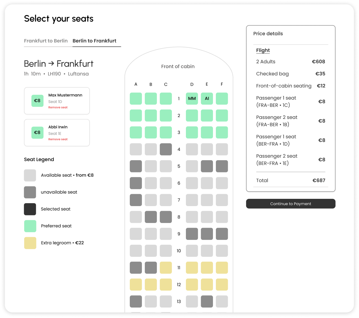
Formalized Leg Toggles and Live-Updating Passenger Cards
The seat page iteration formalized the Outbound and Return toggles so the active leg is unmistakable, and each passenger card now updates live with the chosen seat number and price the moment a seat is tapped. This pairs the spatial action of selecting a seat on the map with an immediate, itemized confirmation in the passenger card and price breakdown, closing the loop between intent and feedback at every interaction.
Payment Page
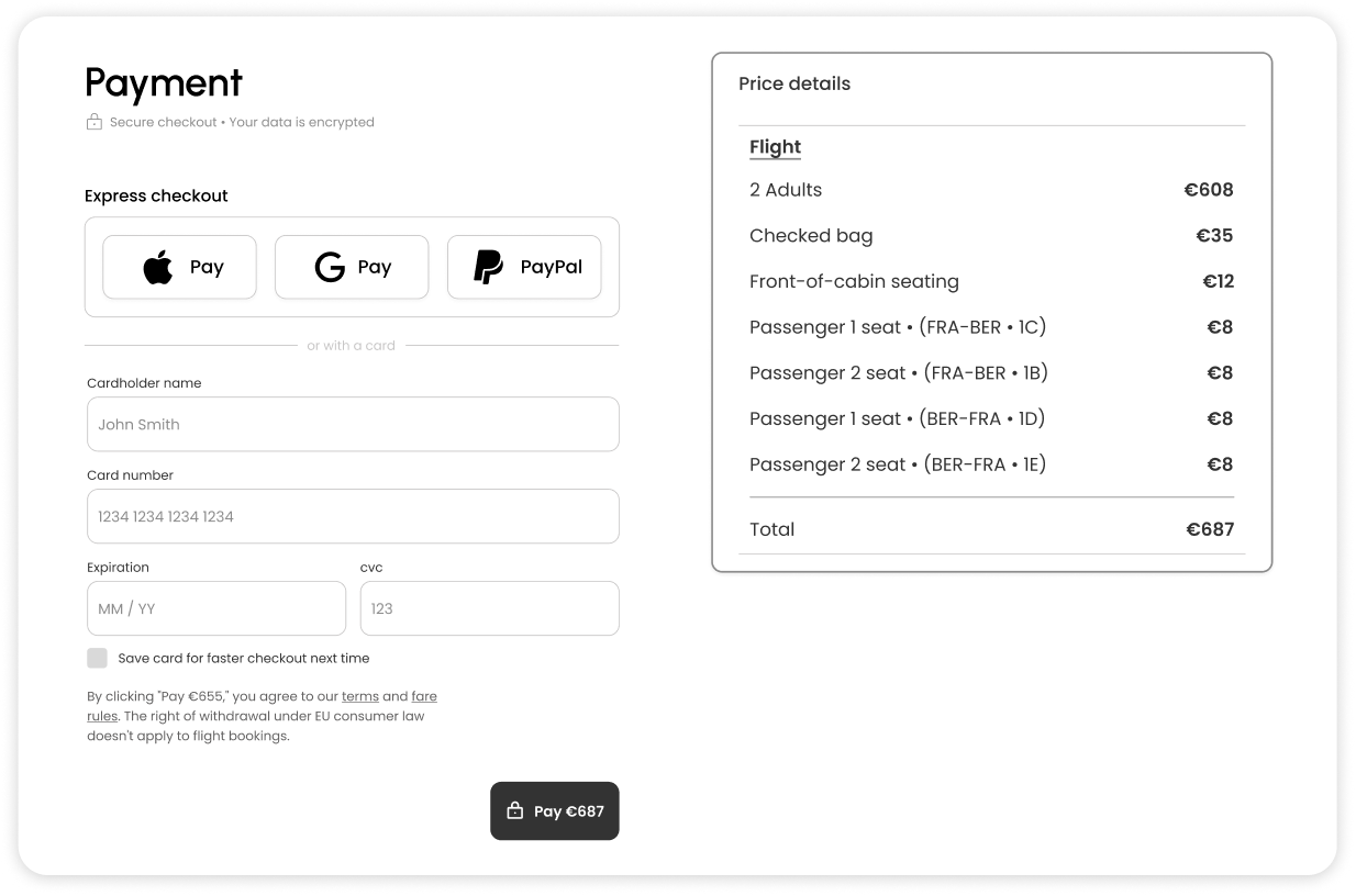
Universal Card Support and Flexible Express Checkout
The payment screen now accepts any card the user enters, removing the earlier mismatch between displayed and supported methods. The most widely used express checkouts — Apple Pay, Google Pay, and PayPal — have also been added, giving travelers the flexibility to pay through whichever method they already trust.

Persistent Booking Summary at the Point of Commitment
A complete Price details summary sits permanently beside the payment form, itemizing every component from the base fare through ancillaries and individual seat costs to the final total. This ensures the user can verify exactly what they are paying for before committing, reinforcing the transparency principle that runs through the entire flow.

High Fidelity Prototype.

With every interaction pattern validated and refined through iteration, the design was brought into a fully realized high-fidelity prototype that translates the structural decisions into a polished, production-ready interface.

Typography, spacing, color, and micro-interactions were carefully calibrated to reinforce clarity at every step, while the updating price ledger, plain-language fare positioning, and explicit add controls came together to deliver the transparent, trustworthy booking experience the research had pointed toward from the very beginning.

The result is a flight booking flow that feels calm, honest, and effortless to move through, where every screen earns its place by helping the traveler make a confident decision rather than asking them to interpret the interface.
If "Flows" sidebar is open, make sure to close it!
The Prototype is only available on Desktop & Tablet (991px)

Reflection & Final Takeaways.


Designing a flight booking experience revealed how often the travel industry asks users to navigate around its conventions rather than designing for the way people actually plan trips, proving that opaque pricing and buried controls can quietly erode trust long before a user reaches the payment page.

■ Looking back on the process, this project deepened my conviction that meaningful design begins with listening before drawing. Observing a real participant move through five competing platforms taught me to trust behavioral evidence over assumption, and watching a user hesitate at the exact moments my own intuition would have skipped past reinforced how important it is to test sketches and prototypes continuously rather than waiting for a polished version to validate.

I came to appreciate that booking flows live or die on the small, unglamorous details: whether a price line names what it represents, whether a calendar tells you which month you are looking at, whether a tab feels like a step or a switch. By aligning structural decisions with how travelers actually reason, short trips versus long ones, allowance over aesthetics, transparent totals over surprise charges, I saw that disciplined information hierarchy and honest cost communication can transform a transactional flow into one that genuinely respects the user's intelligence.

■ Overall, this project sharpened my ability to balance density with clarity and ambition with restraint. It reinforced that great UX in a high-stakes domain like flight booking is not about adding more, but about ensuring every visible element earns its place by helping the traveler decide with confidence and reach the end of the flow feeling in control rather than outmaneuvered.

Let’s connect.

I’m always looking for new challenges and collaborations. If you’d like to discuss this project further or see how we can work together, feel free to reach out.

Email: Deebot14@gmail.com

Linkedin: linkedin.com/in/adeeb-graissy

Web & App Design Portfolio:
https://adeebs-portofolio-cdcd19.webflow.io/

GitHub: github.com/Deebot14