Anxiety and fatigue spike when logistics are hard to verify at the final booking step
Following usability testing, I implemented 3 key component refinements to better align the interface with user mental models:
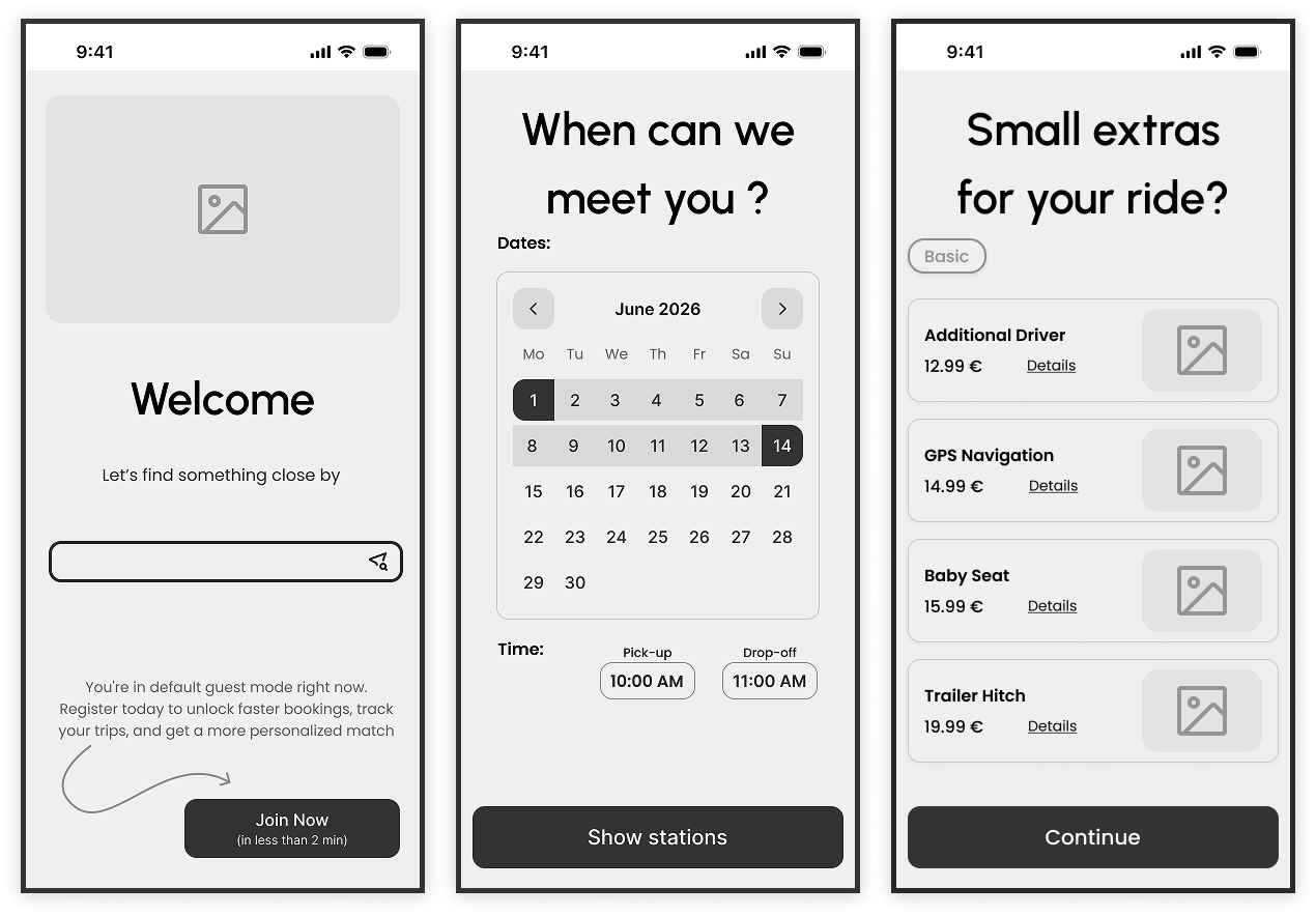
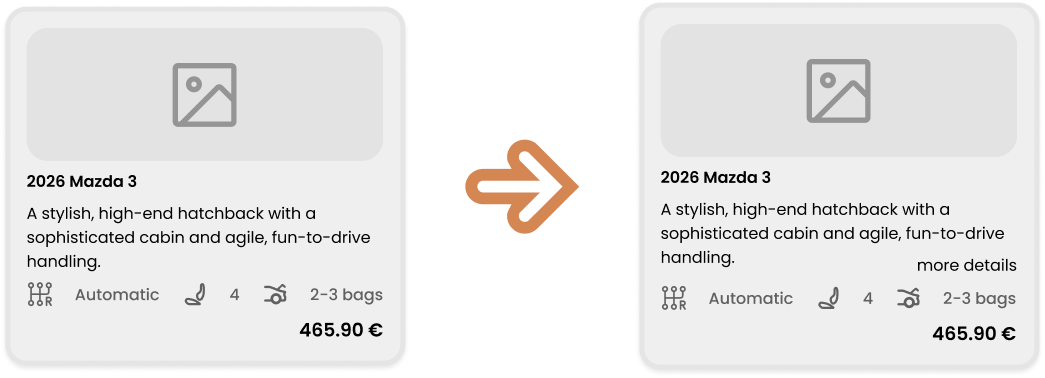
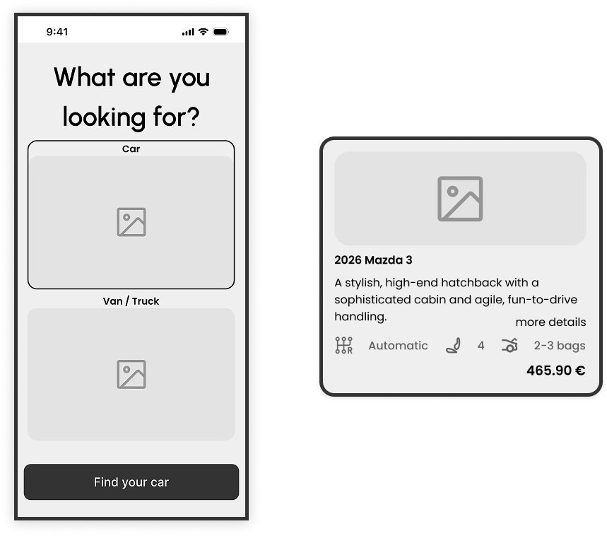
■ Vehicle Selection: Balancing Visuals with Information
Through usability testing, I observed that participants relied heavily on car visuals but often felt overwhelmed by technical specifications they didn't fully understand. Most users prioritized just three key factors: car type, transmission, and price.
■ My Approach
I streamlined the primary vehicle card to display these essential data points, reducing cognitive load. However, to support power users or those with specific needs, I integrated a "More Details" CTA. This iteration improves the experience by keeping the interface clean while providing an optional "deep dive" for users who require total transparency before committing.
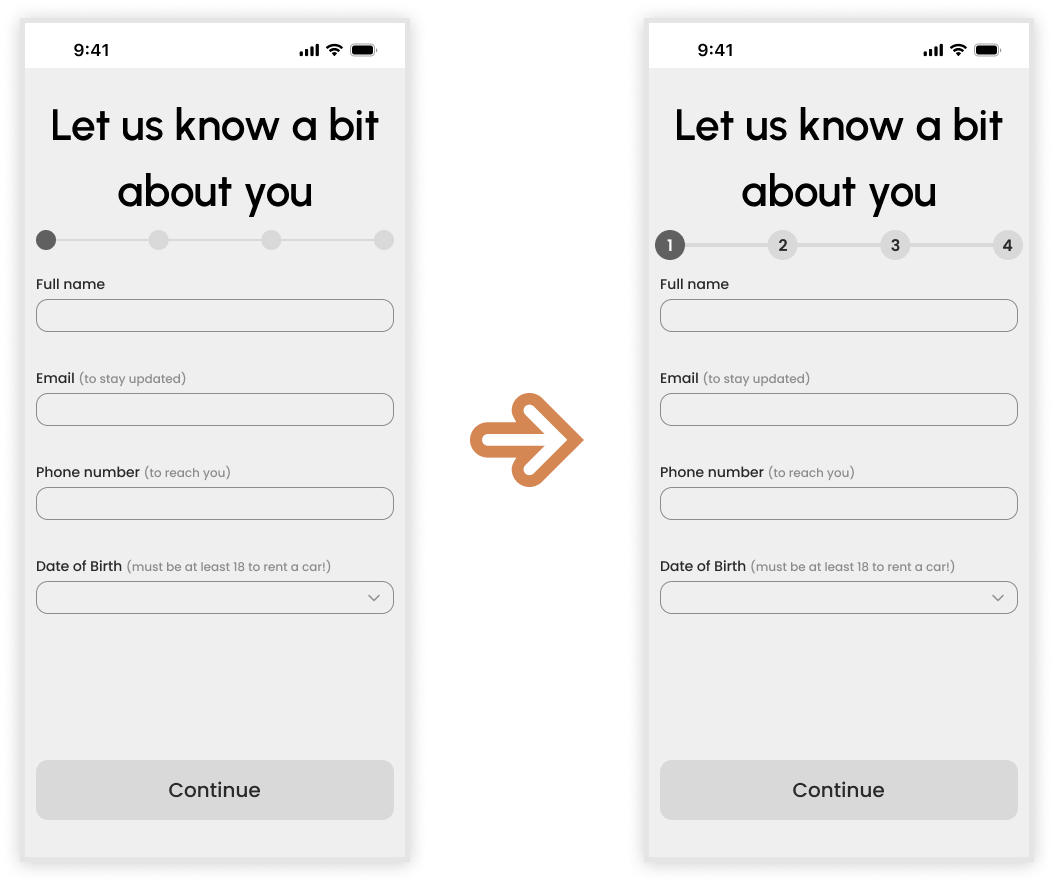
■ Step Indicator: Defining the Path
Testing revealed that a vague progress bar created a perception that the booking process was longer than it actually was, leading to minor user fatigue.
■ My Approach
I increased the scale of the step indicator to improve visual prominence and transitioned from a simple line to numbered stages. This change gives users a clear mental map of the journey, letting them know exactly where they are and how many steps remain, which significantly reduces the "perceived length" of the checkout process.
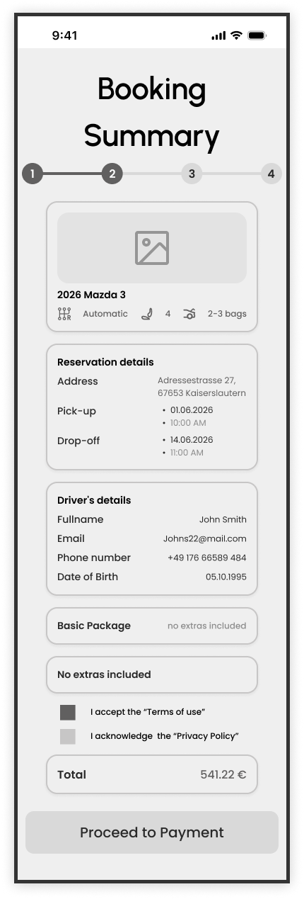
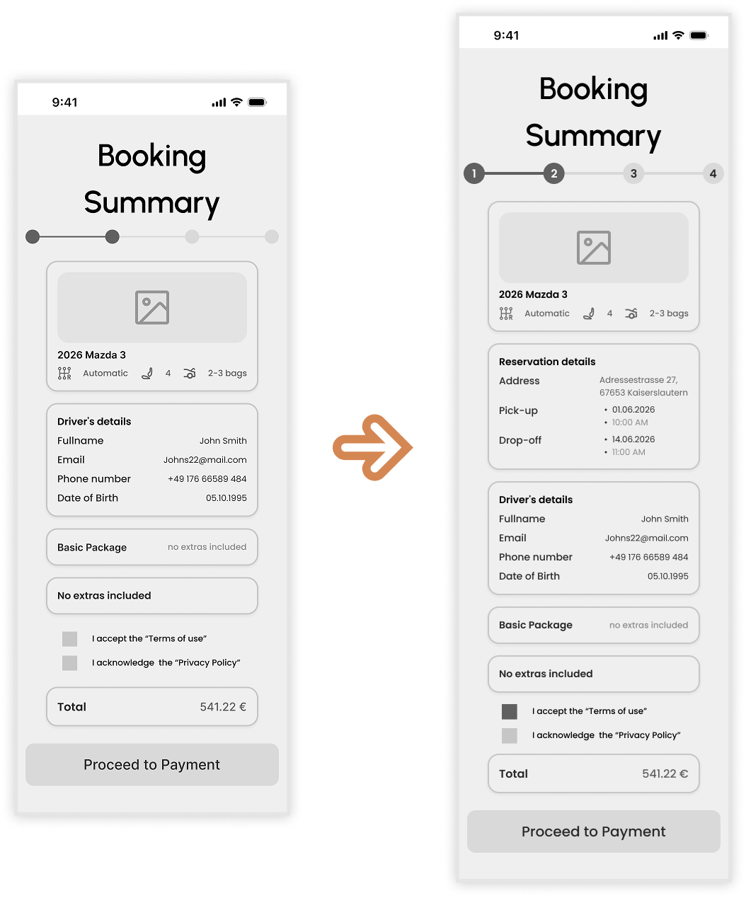
■ Booking Summary: The Verification Safety Net
A critical insight gained during testing was the user's need for a final "sanity check" before payment. I realized that while the flow was functional, it lacked a centralized place to verify the logistical details.
■ My Approach
I introduced a dedicated Reservation Details card within the summary page. By consolidating the pickup/drop-off address, dates, and times into one high-visibility component, I created a "safety net" for the user. This ensures they feel confident in their logistics, preventing the "negative perception" or anxiety that often occurs right before a financial commitment.
Global Interaction Enhancements.
Beyond specific components, I implemented several app-wide logic and usability updates to align the interface with actual user behavior and industry best practices.
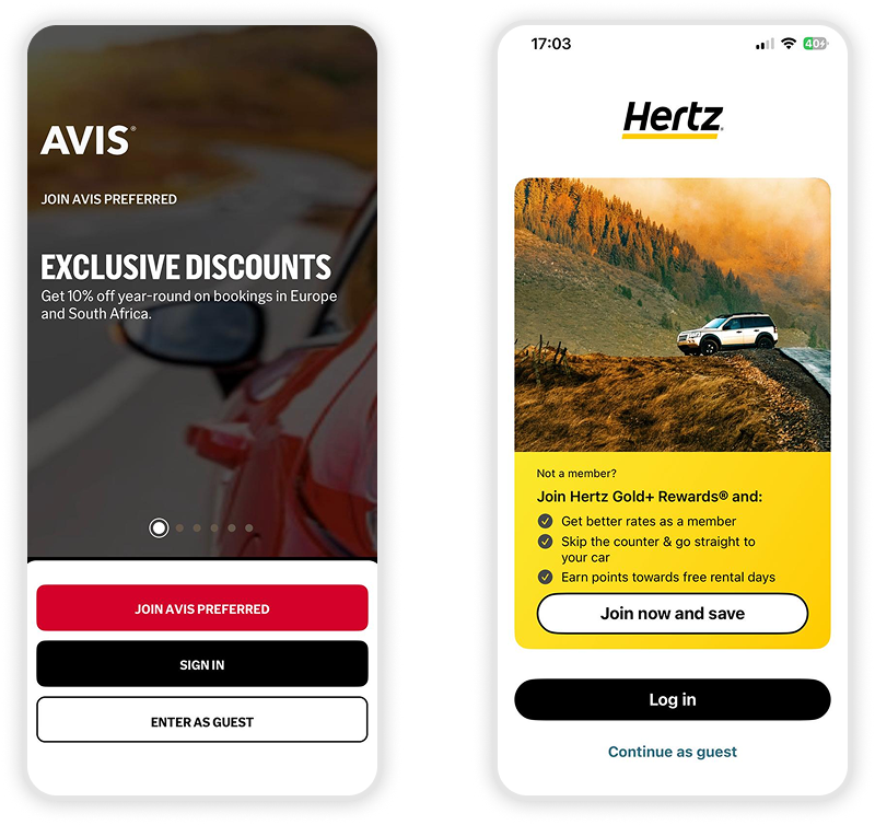
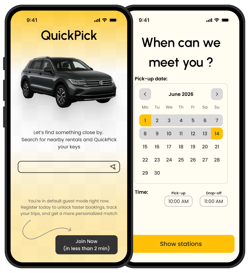
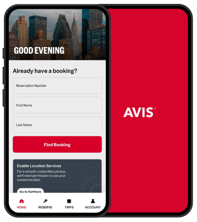
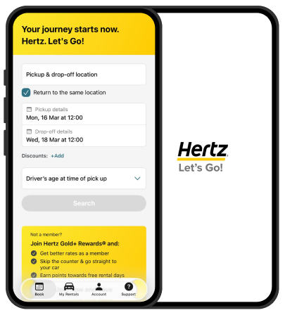
■ Prioritizing Guest Access
Through competitor usability testing, I observed a consistent friction point: many apps force users to sign up before they can even browse inventory.
Notice how the competing apps lead the user toward clicking "Join," "Sign In," or "Log In" by utilizing prominent brand colors and high-contrast buttons. In comparison, the option to "Continue as Guest" is designed with a relatively smaller font and bland, low-priority colors. This creates a visual hierarchy that pressures the user into an immediate commitment rather than allowing for a low-friction entry into the app.
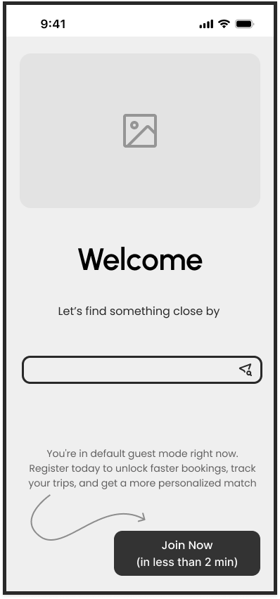
Since every participant in my study preferred to "Continue as Guest," I made Guest Mode the default experience. By moving the registration option to a secondary button on the homepage, I lowered the barrier to entry, allowing users to reach the core value of the app immediately without upfront commitment.
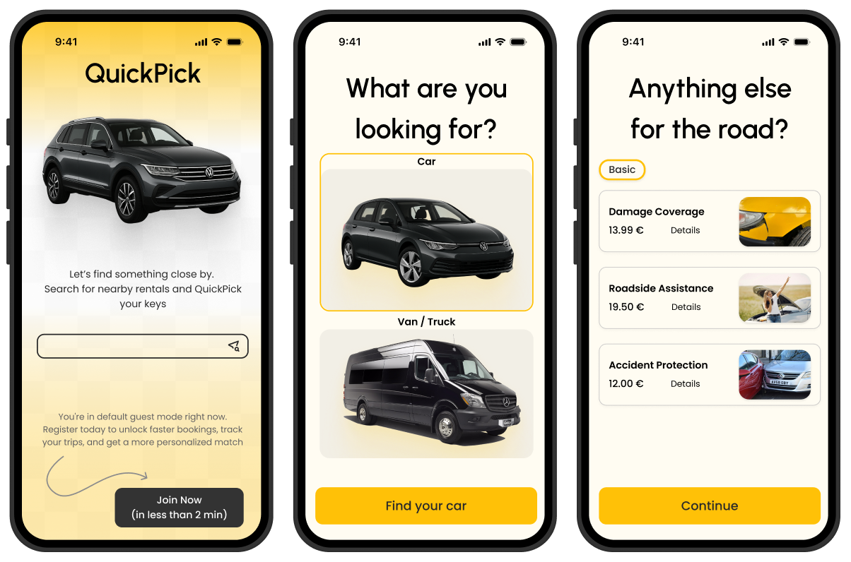
■ Visual-First Hierarchy
Recognizing that car rental users are highly visual decision-makers, I audited the entire app to ensure images were scaled to an impactful and reasonable size. By prioritizing clear vehicle renders over dense text blocks, I created a more engaging aesthetic that helps users identify their preferred car at a glance, satisfying the behavioral need for visual confirmation seen in the “Browse cars” & “Select a car” phase of the journey map.
Since every participant in my study preferred to "Continue as Guest," I made Guest Mode the default experience. By moving the registration option to a secondary button on the homepage, I lowered the barrier to entry, allowing users to reach the core value of the app immediately without upfront commitment.
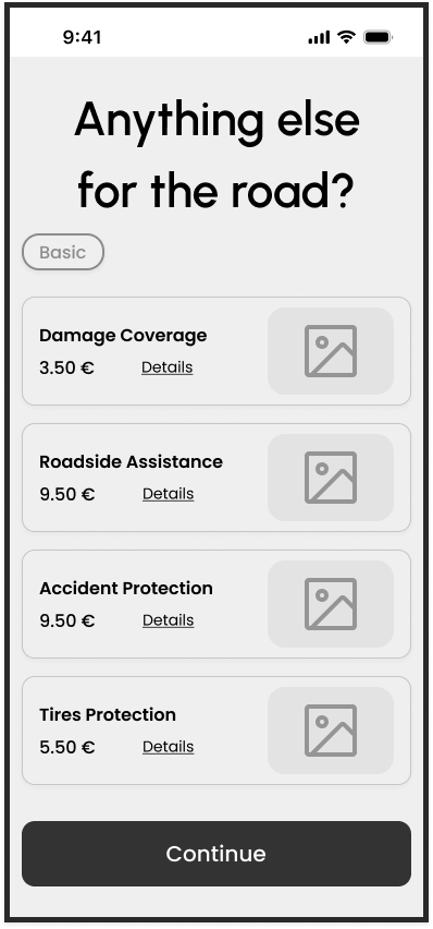
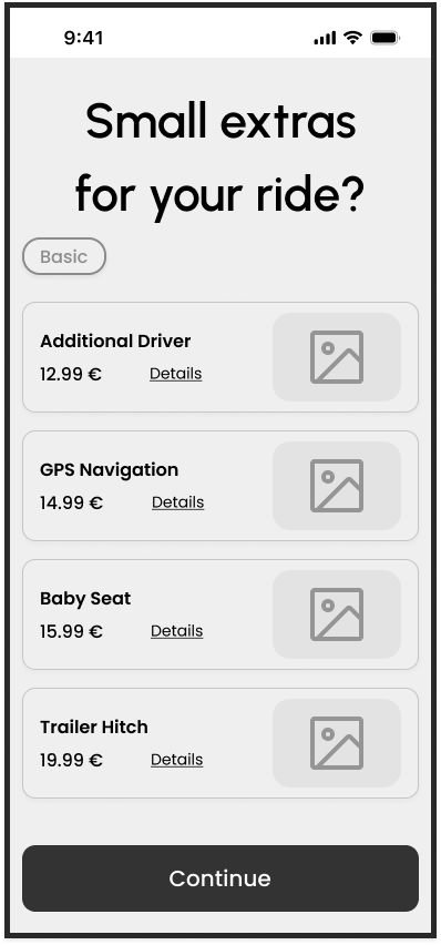
■ Progressive Disclosure for Add-ons
The "Packages" and "Extras" pages are traditionally information-heavy, leading to the "overwhelmed" feeling noted in user research. Since most rental add-ons (like GPS or Child Seats) are self-explanatory, I stripped the UI down to titles only. I implemented a “More Details” toggle for each item, which maintains a clean interface for the majority of users while providing full transparency for those who need to inquire further.
Since every participant in my study preferred to "Continue as Guest," I made Guest Mode the default experience. By moving the registration option to a secondary button on the homepage, I lowered the barrier to entry, allowing users to reach the core value of the app immediately without upfront commitment.
■ Navigation Control & Heuristic Alignment
To increase user confidence during the final checkout, I transformed every card on the Booking Summary page into a clickable entry point. This decision was rooted in the Heuristic Evaluation principle of "User Control and Freedom." If a user spots a mistake in their dates or location at the final stage, they can tap the specific card to be directed back to that exact step. This functional enhancement prevents the frustration of "starting over" and ensures a seamless, bidirectional flow.
.png)

.png)